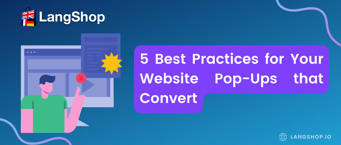
Pop-ups provide shoppers with new touch-points outside the website. Companies use pop-ups, ads, or content to increase sales and attract new customers. The pop-up technique can increase brand awareness by introducing the brand to people who might be ignoring the ads. It can quickly lead potential customers to the interaction and purchase stages by providing discounts and special offers only for a short period of time.
As technology has evolved, pop-up formats have improved as well. This process still continues: marketers are constantly developing their online marketing strategies and finding new ways to use pop-ups as well as expanding their functionality.
For a long time, pop-ups have been used too aggressively as a part of online marketing strategy. For example, pop-ups were opened automatically after closing, and they could not be removed until the target action was completed. Fortunately, the negativity around pop-ups is gradually subsiding. Pop-ups are a valuable marketing tool when used correctly.
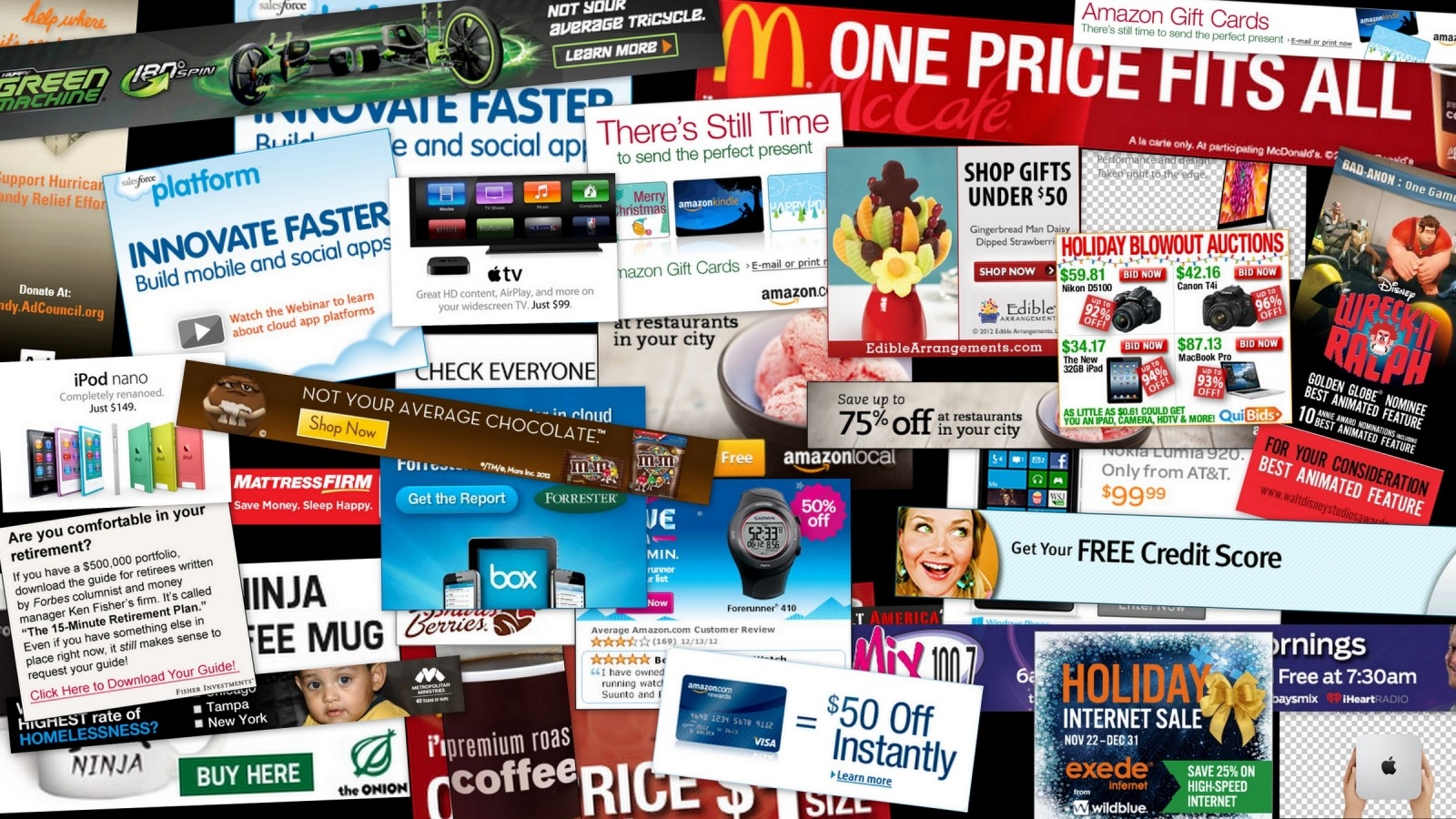
Pop-ups can be used to:
- inform the customers about promotions and special offers;
- showcase a new product or service;
- offer a newsletter subscription;
- highlight a useful function;
- remind customers about the items in the cart.
Pop-ups Pros and Cons
Pop-up campaigns are a marketing tool that you can use to collect leads, reduce page bounce rates, improve site conversion rates, and increase sales. Pop-ups are divided into 2 main types: hello-board and page-stop.
- Hello-board. This type of pop-up covers a part of the screen. It may appear anywhere on the page. For example, this type of pop-up is often displayed as a narrow bar at the top or bottom of the site. It does not block the functionality of the site as well as does not interfere with viewing and use. In addition, this pop-up can be easily closed.
- Page-stop. This type appears in the center of the screen or covers most of the page. The visitors cannot skip it until they perform the target action or force close the window.
Hello-board pop-ups are less annoying than page-stops because they are less obsessive and can be ignored. But page-stops are considered more effective because they enforce users to stop and read the information.
Let’s discuss the benefits and drawbacks of Pop-ups.
Key benefits include the following aspects:
- A pop-up is a good part of an online marketing strategy that provides you with the opportunity to establish communication with site users. Thus, you can get feedback promptly, announce important information, and encourage communication.
- This marketing tool helps to increase the site conversion rate since pop-ups are much more effective than banners.
- Price. This type of advertising is cheap and does not require large investments.
- Popups can be designed and customized in different ways. For example, you can make the window appear on a specific page of the site or even in a specific area, appear at a specific time or even after a certain visitor action.
- The pop-up is guaranteed to attract the customer’s attention. But whether it will irritate site users depends on how you design the pop up, where you place it, etc.
The drawbacks of pop-ups:
- Pop-ups are one of the most hated types of ads. In the past, advertising through pop-ups was commonly used by frauds to introduce malicious software.
- Pop-Up Blockers. Many browsers have a pop up blocker that will prevent the ad from appearing on the page.
- It can damage the brand’s reputation. Users may feel negatively toward the brand featured in the ad because of intrusion.
Despite all the cons, pop-ups are still popular, which means they are an effective part of a marketing strategy and can be involved in your business as well. In order to attract users to your brand, let’s explore the best practices for pop-ups.
Best Practices for Your Website Pop-Ups
- Choose the correct pop-up format
The position, size, and design of your pop-up affect how they are perceived. If a pop-up takes up the entire screen, it may cause the website visitor’s session to be suspended and this could be a negative for the user.
You need to remember that the way you display your pop-up campaign is critical to getting results. Users should be interested in the provided information rather than be annoyed by your site.
The best choice, undoubtedly, should be determined by comparing several versions of the pop-up campaign.
- Customize pop-ups to match your brand
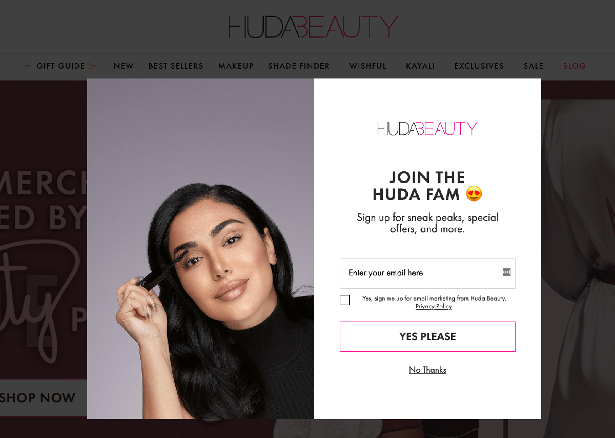
A great pop-up looks like a natural extension of the website, minimizing the feeling that the pop-up is an aggressive advertisement. Branding pop-ups with your company logo, color scheme, and fonts is a good way to make them look good and feel familiar.
Here is an example: Huda Beauty's email pop-up has been created with this practice in mind. They make it feel less of an interruption and more like part of the website.
- Provide pop-ups translation
In order to make your pop-ups less annoying, people should understand the provided information. Don’t forget if your online business is multilingual the pop-ups should be translated as well.
Thanks to LangShop, you are able to translate pop-ups into a target language on your multilingual website. Since pop-ups are such an important part of your online communications, it is a right decision to prioritize pop-up translation when creating your multilingual online marketing strategy.
- Make pop-ups easy to close
Incorrectly used pop-ups are plenty annoying, but you know what’s even worse? If they are difficult to close. In order to prevent customer dissatisfaction, the close button should always be clearly visible in your pop-up campaigns.
The best practices here include:
- don't make the exit button too small,
- place the button on a contrast background
- test the different positions to ensure the button is visible.
- Alternatively, you can provide a ‘No, Thanks’ button to make the exit even easier.
- Check pop-ups accurately
Pop-ups are one of those website elements where the slightest change can make a significant difference. Pop-ups need to be constantly tested for their effectiveness - do they really convert visitors?
It’s vital to make variations, offer them to visitors in order to understand which one is the best. By testing multiple versions, you'll be able to find the best design, position, wording, etc. to achieve the highest results.
Summary
Pop-ups are still a very powerful marketing tool to interact with website visitors and achieve better sales results. However, pop-ups are also an element that can easily ruin the user experience.
By following these pop-up best practices, you will be able to achieve the best results.
And by using LangShop to translate your pop-up campaigns, you can reach a greater number of users from all over the world.

