Multilingual websites are a great way for eCommerce businesses to expand new borders, attract foreign audiences and boost sales. But to create a comprehensive navigation through the website for every single visitor, you will need to work really hard. However, a good localization tool and a few useful tips collected from world-known brands will help you achieve success with minimum efforts from your side.
Let’s slow down here to figure out what you really need to create a multilingual website. The first thing that comes into mind is multilingual content. Of course, it’s obvious that multilingual websites should have content in more than one language. Also, you expect your multilingual website to attract foreign buyers. For it, you will need multilingual SEO, a must-have feature for any quality translation app. And finally, you need to implement a convenient way to switch languages, so the foreign buyers could see your website content in their native language.
And here are two main ways to switch languages:
- Via language autodetection mode;
- With the help of language switchers.
We can have a long discussion on which method is better, but the thing is that you can use them both to advance the language detection system. In this case, when entering a website a user will see content in the language recognized by the autodetection mode, and will have an opportunity to change it with language switchers. It increases chances for shoppers to understand website content and find a desired product there.
Now, let’s learn more about switchers and their role for multi-language websites.
What is a language switcher?
Language switcher (selector) is a button, dropdown or toggle that allows users to switch languages on the multilingual website. The easiest way to add a language switcher to the website is by using a translation app, which provides this feature. Language switchers are considered to be the best way to present multi-language content through, as they don’t harm your SEO and improve user experience.
Let me prove the above statement with an example. Imagine, you come to South Korea to live there for a couple of months. As a newcomer, you will need to buy a lot of stuff. To do this, you use the same website you used for shopping in the US, because you know it's a world brand. And what an unpleasant surprise you will get when you find out that this website shows content in Korean, which you haven’t managed to learn yet!
The first and, at the same time, the last thing you will do is to look for a way to switch languages and if you fail, you’ll leave this website and go to the competitor.
The importance and usefulness of switchers also proves the fact that most world-know brands implement them into their stores. We’ve looked through these stores and distinguished the main similarities in switchers usage, so you could implement these practices for your online store.
Top 3 tips to design language switchers
Tip-1: Make your switchers easy-to-reach.
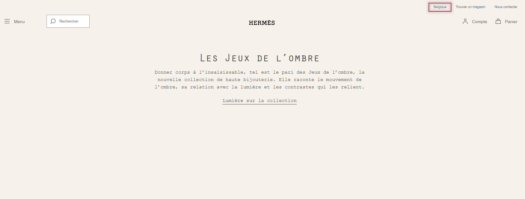
First of all, you never know where the customer journey on your website can start from and where they would like to change the language. For this reason the language switchers should be displayed on every page of the website, which has multi-language content.
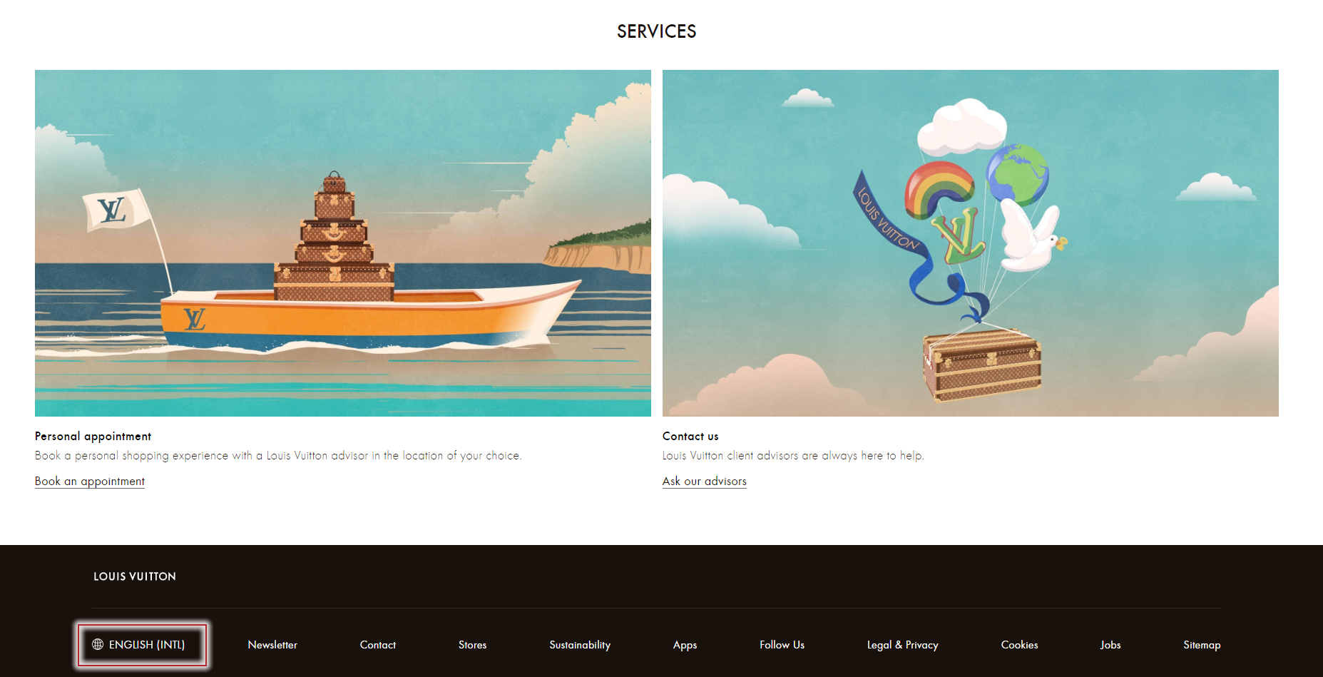
The next thing you should decide is their location on the page. According to our research, the first place shoppers go when looking for a language switch is header (the top of the page). If they haven’t found a switcher there, they scroll down to the footer and search it there.
Of course, all shoppers are different. So, even though the most obvious places for switchers on the page are top-right and bottom-left, you can experiment and find the option which suits your store the most.
Tip-2: Don’t name countries, offer languages.
It’s all about customer comprehension - if you speak German, it doesn’t mean you live in Germany. People from Latin America hardly associate themselves with Spain though they speak Spanish. As a merchant selling abroad you should understand that a country shouldn’t represent language. Finally, what to do with Canada, which has several native languages, or the US, where millions of immigrants live who may not understand English.
Same thing happens with flags. Using flags as icons can catch people’s eyes and, in this way, easily find a switcher, but it also has some significant drawbacks:
- What flag to choose for bilingual or multilingual countries? Canada, Belgium, Singapore, South Africa, - there’s a lot of multilingual countries and nations, which will be confused by flags and their meaning.
- What country flag to choose to represent a language spoken in more than one country? For example, French is spoken in France, Canada, Belgium, Switzerland, Madagaskar, etc. Will Madagaskar buyers associate themselves with the French flag? They may even not know how the French flag looks.
- What’s about cultural sensitivities? The disputes around the borders and independence of some countries are eternal. For example, Kuril Islands or Gibraltar are considered to be disputed areas. So by referring these or those territories to specific countries, you may offend people, which is unwelcomed for sales.
- What about similar-looking flags? Switcher icons are not so big, so it’s easy to confuse similar flags or even don’t find the needed one. It will cause customer irritation, especially when they have to accept cookies on each language version.
Tip-3: Use different switchers for languages and currencies.
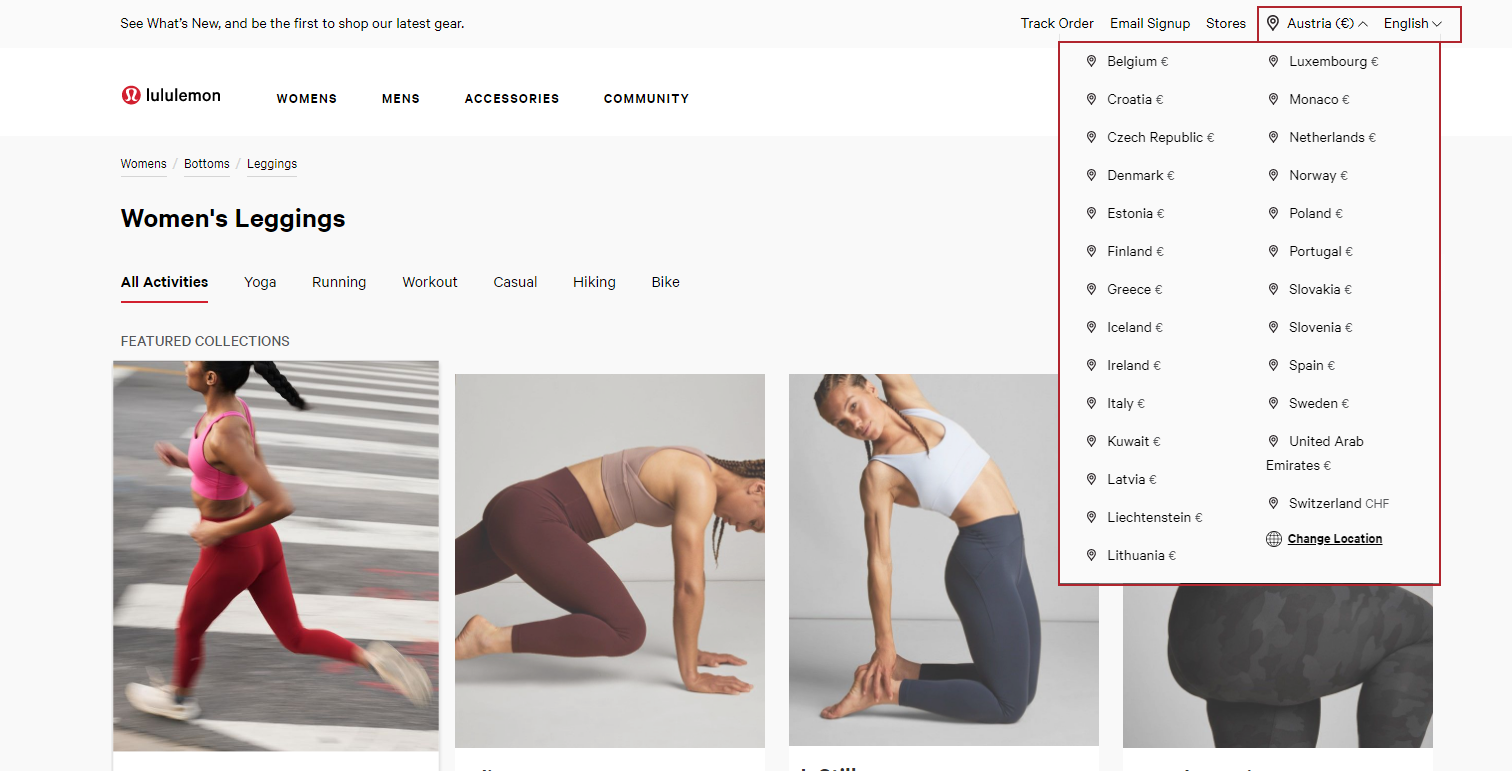
A lot of websites connect language and currency switchers, making them tightly coupled. It makes the purchasing process easier for one user, and spoils user experience for the other. In the majority of cases, the US customer will choose dollars to pay for the purchase, but what if he wants to pay with euros or yens?
The reasons for it can be different, here are only some of them:
- A user is a tourist and has only national currency on the credit card;
- A customer uses VPN and even though he understand English, he’d like to pay with national currency;
- A user buys a present for his US friend, so he chooses this location, but has an opportunity to pay with national currency only.
Even though these cases can be a rare thing, it shows the imperfection of this system and may deter potential buyers from making purchases on your website (see the below example).
How can LangShop help you to implement switchers?
LangShop is one of the best translation apps on Shopify. It allows users to create not only language but also currency switchers. You can also customize switchers by changing color, applying appealing fonts, adding icons, adjusting styles, etc.
Let’s see how it works in LangShop admin. To add a language switcher in LangShop, go to Settings > Switchers > Language Switchers. Open Switcher №1 and change switcher status to Published.
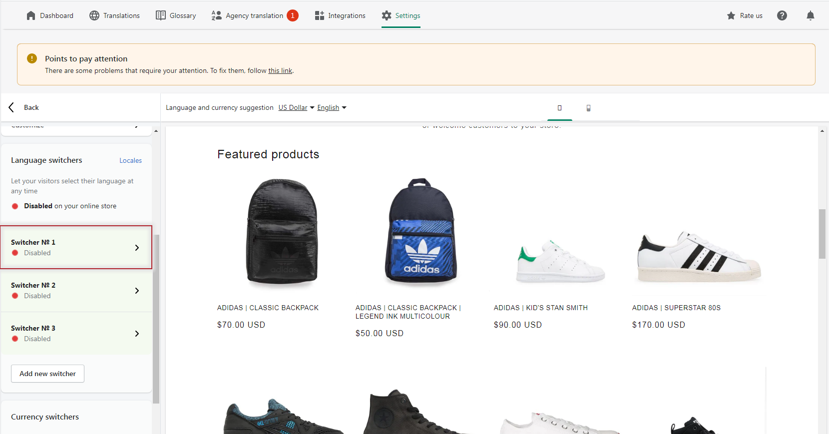
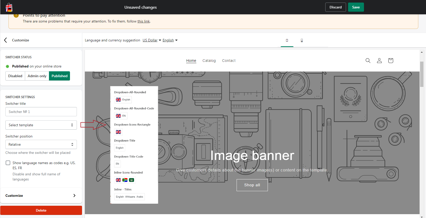
In switcher settings block add switcher title, select template and position. There’s a range of templates for switchers, some contain icons, the others don’t, some have inline form, the others dropdown, etc. Among the represented positions are the most popular: top-right, top-left, bottom-right, bottom-left, and relative position. The last option allows users to place the switcher in a custom position on the page.
Here you can also enable features to show language names as codes (usually two first letters of the country or language name).
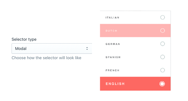
You can also use advanced settings to specify switcher style. Here you can adjust switcher type, display, icon type, set style and visibility. To enable advanced settings, tap the Customize button.
Here you’ll find more options for switcher type settings, which includes Dropdown, Inline, Select, IOS and Modal. The switcher display settings, available almost for every switcher type except from Select type, define whether it will show only icons, only titles or both.
Next you can add offset, isolate styles and define switcher visibility to reach its perfect look on the page on any device.
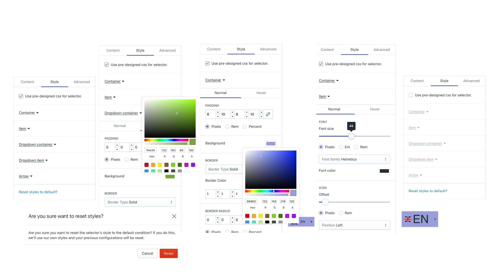
And finally, you can customize the style of your switcher. In the style tab, there’s an opportunity to adjust border, font, background color, set paddings, sizes and offsets.
When all needed settings are added, enable the switcher on the storefront so your customers could see it. For it, click Proceed on the appearing popup “Enable language and currency switcher for this theme” or click the link on notification “Point to pay attention”.
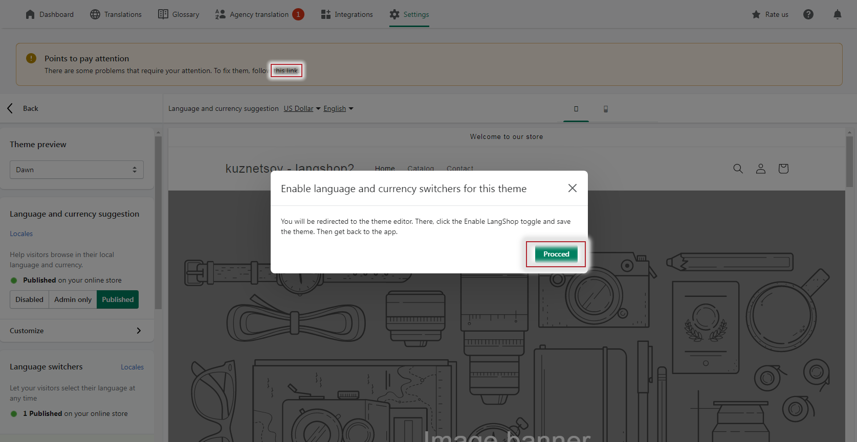
You will be redirected to the Theme settings. In the right sidebar panel you will find the App embeds column. Enable LangShop by tapping toggle and save settings.
Install LangShop to easily add, customize and achieve the perfect look and feel of language switchers on your multilingual store!

