Any successful business gives special heed to website design as the primary means to reach its target audience. But what if the target audience is different? How to design your website if your business is aimed at multiple countries' coverage?
Although when we speak about online stores everything is individual, there are some general practices you can follow to create outstanding design for your multi-language website to convert shoppers throughout the world. We collected 9 main tips to follow for designing your multi-language website. But first let’s define what types of websites we call multilingual.
What is a multi-language website?
A multi-language website is a website which features content in two or more different languages. Although it’s called multi-language, it can include not only text in different languages, but also other types of content, including different visuals, layout, social media, etc., associated with specific language versions of the website.
As you have already guessed, to make your website multilingual a lot of important decisions should be made. You should decide what pages to translate, choose the layout for the website, solve SEO issues, etc. But what is more important, you should make the design of each language version localized and appealing to the new audiences from other countries.
Tips to help you create an engaging multi-language website design
With the right translation tool like LangShop, a hard task to create a successful multilingual website can become a piece of cake. However, a few tips can help you reach the maximum efficiency in selling worldwide.
1. Take into consideration text expansion
When designing a multi-language website, you should pay attention to text expansion, the difference in length between the source and translated text. According to W3C text expansion can reach 300% for small strings when translating from English to Italian. It means that your website text can triple remaining on the same layout or get 2x decreased in case of translation to Korean and Japanese.
If you have faced this problem, consider moving from literal translation or removing some unnecessary text blocks using LangShop manual editing feature. You can also change text size and font for a specific language version.
2. Add culturally conditioned visuals
Visuals are the favorite piece of content for any customers, as sometimes they speak louder than hundreds of words. However not all pictures well-accepted in your local country will have the same effect in another. Countries are full of different cultural foundations and peculiarities you should take into consideration when entering their markets.
Avoid using visuals, which can hurt people’s feelings, make them angry or trigger them due to some traumatic events in the history of the nation. Try to follow countries trends and agenda. Thus, the Victoria’s Secret homepage visual is different for the US and UAE shoppers.
The US website version follows the trend on body positive and racial diversity. It’ll attract more buyers who share the same ideas and concerns.
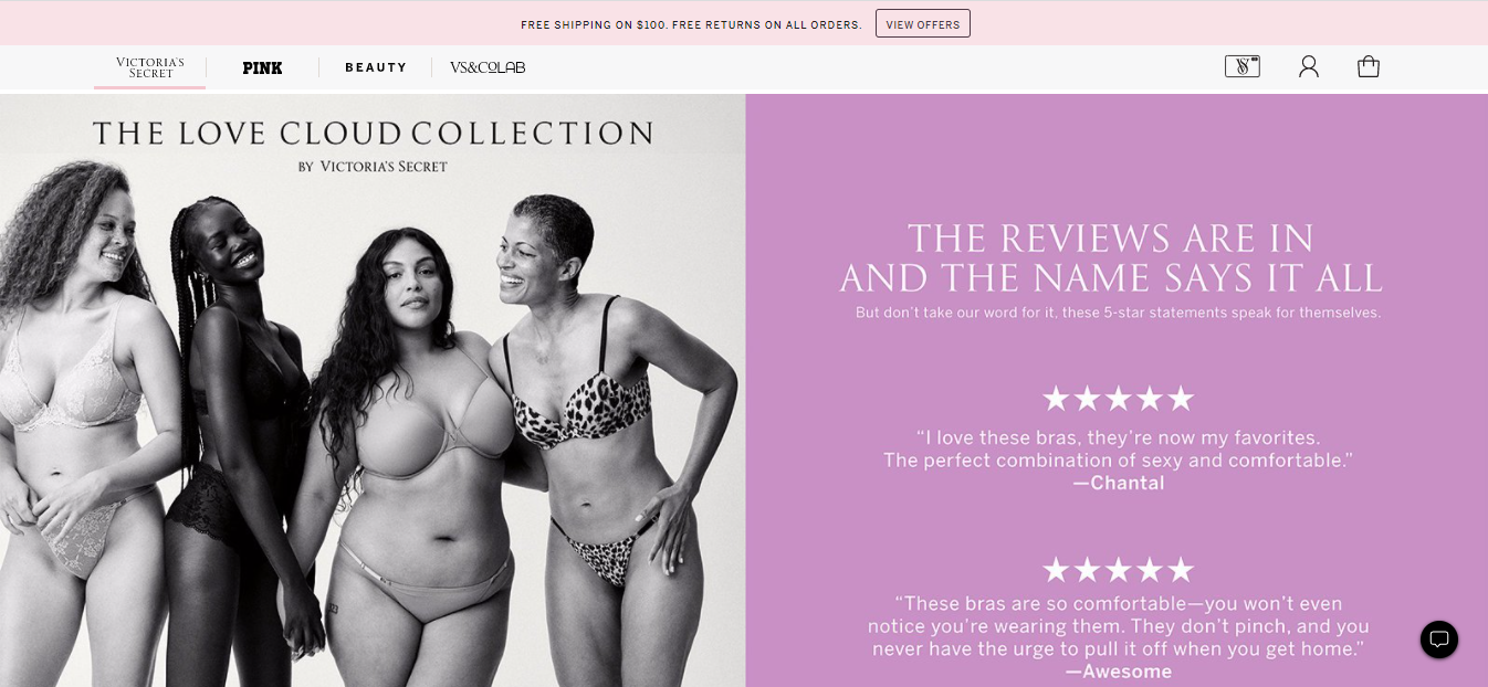
The UAE has a more conservative audience, so the homepage reflects more typical for this brand visuals.

3. Choose appropriate colors for each country
Not only visuals can evoke unpleasant emotions and associations, colors also play an important role in brand’s perceptions. Different countries interpret colors differently, so when exploring a foreign country merchants should take it into consideration.
Let’s take yellow as an example. While for Polynesia and China yellow is considered to be the color of divine essence, for the US and Canada shoppers it’s associated with duplicity and spontaneity. So when choosing a color palette for your multi-language website, make a small research on colors associations in targeted countries.
4. Keep consistent branding
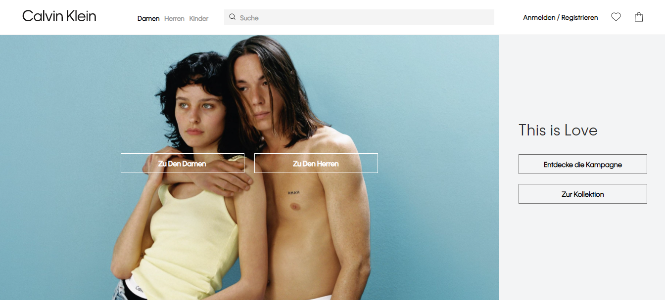
Despite the fact that you can change some visuals for different website language versions, it’s important to know the limit. No matter what country your shoppers are from, they should recognize your website and your brand even if they accidentally choose the other language version. It’s possible only with consistent branding.
For example, here’s the landing page of Calvin Klein website on swedish language:
The same layout but with content in other language has the Spanish version of this landing page:
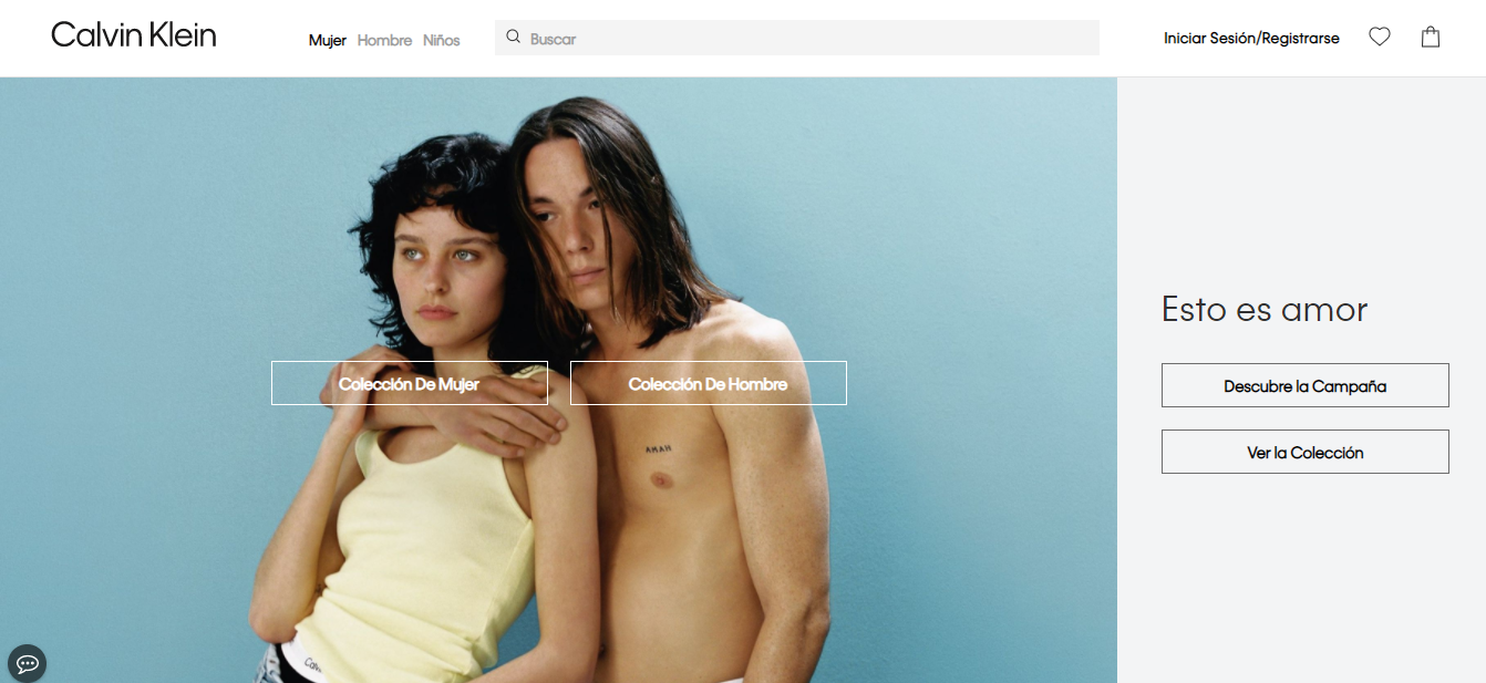
As you can see, even if the spanish-speaking customer gets to the Swedish website version, they’ll have no additional concerns when switching to the needed version.
Here, the LangShop app will be especially useful for you, because you don't need to put in much effort into creating a consistent website with it. LangShop creates an identical analog of your Shopify theme called LangShop theme, which you can use and customize for your multi-language online store. With it you don’t need to create a unique content for each language version, the translated content will display for a chosen language once the translation is performed.
5. Use language switchers
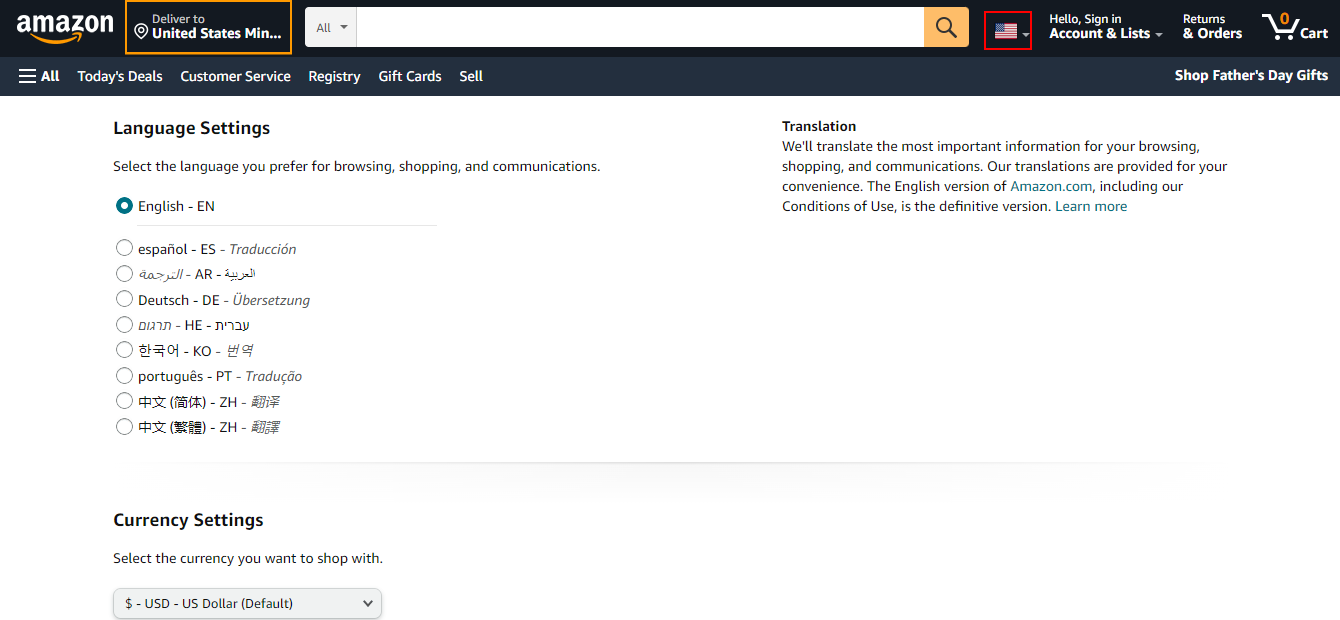
We all like to see the website in our native language. Operating with this statement a lot of big multilingual websites set country autodetection mode, completely disregarding the fact that it can be inconvenient for bilingual customers or immigrants. If a website visitor lives in Poland, it doesn’t mean they want to browse your website in Polish. So our advice is to combine autodetection mode with switchers.
However, switchers should also be customized appropriately and here are the reasons why. One more popular practice among big brands is to offer customers to choose the country instead of language. However it can cause some confusion. If the person speaks Spanish but they are in France what option they need to choose? What if they choose Spain and find the inventory available only for Spain with country-specific taxes and shipping costs?
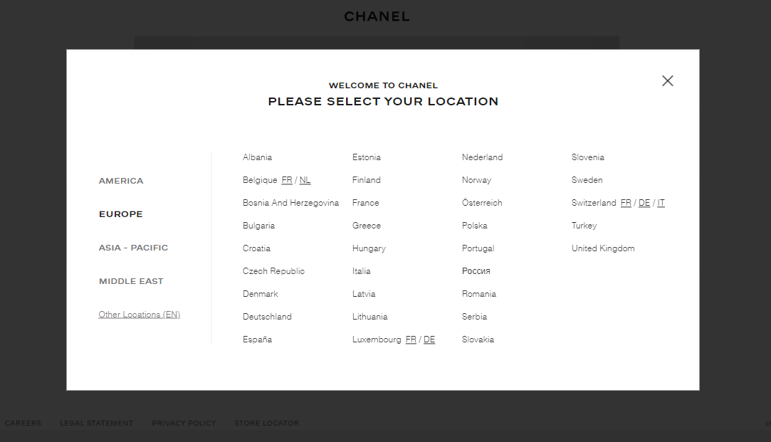
That’s why it’s important for your translation app to give you an opportunity to customize switchers on your tastes and needs. LangShop offers merchants to choose language switchers position, font, color, icons, and text.
General tips:
- You can use flags as additional visualization to the text for switchers but try not to use them individually. Not everybody knows all flags, some flags look similar and due to the small size of the flags customers may not recognize it.
- Place the switchers on every page of your website, which has a language version.
- The best position of the language switchers are the top right or in the footer.
- Write switching options in the language it refers to, so customers can easily find the preferred one.
- All switching options should be visible and easy-to-reach.
6. Don’t forget about SEO
Every really good translation app provides multilingual SEO, the website optimization to match search queries in different languages. In other words, it is the way to say to search engines that your content is suitable and relevant for this region. Hence, it’s important to add specific hreflang tags for each language version of the website, translate meta tags, generate a multilingual sitemap and so on. Learn more about how you can create multilingual SEO for your website here.
7. Pay attention to encoding and fonts
Choosing the right encoding for your website is also important, as your content should be readable. The recommended encoding for multilingual websites is UTF-8, as it supports many natural languages as well as many non-spoken ones. The few exceptions not supported by UTF-8 (like Klingon) have unofficial private unicode code pages.
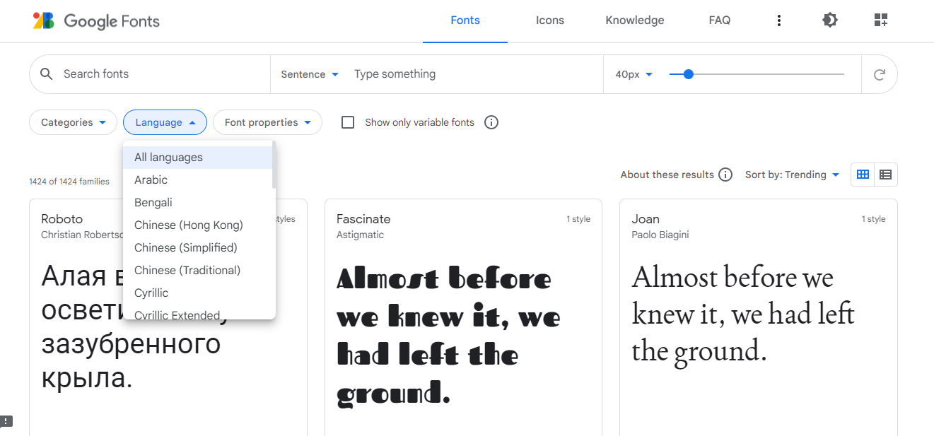
One more thing, which can hinder content readability is font. Besides the fact that alphabetic characters used by different languages are of different default size and can appear to be too small and illegible with specific fonts, not all fonts are compatible with all languages. The font for a multi-language website must contain all the characters and glyphs used in the content. You can use Google Fonts to find the best match for your website.
8. Create comprehensive design for RTL languages
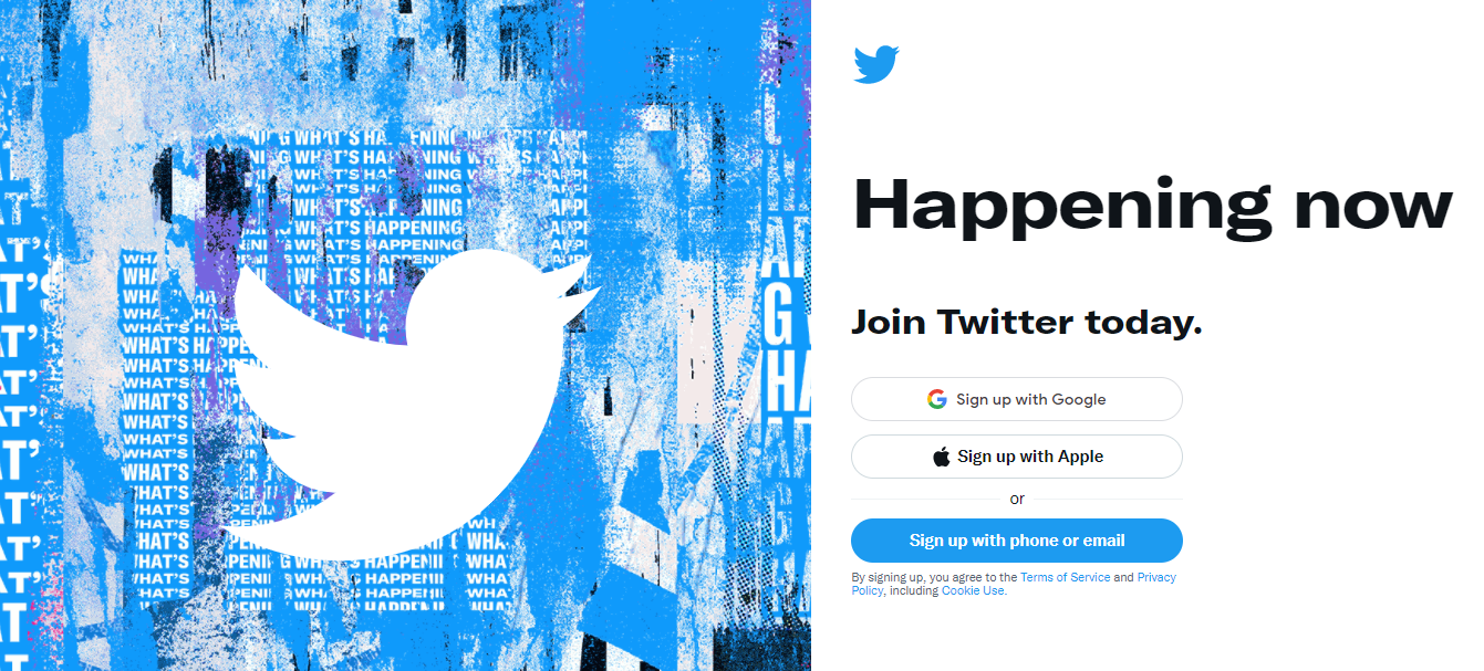
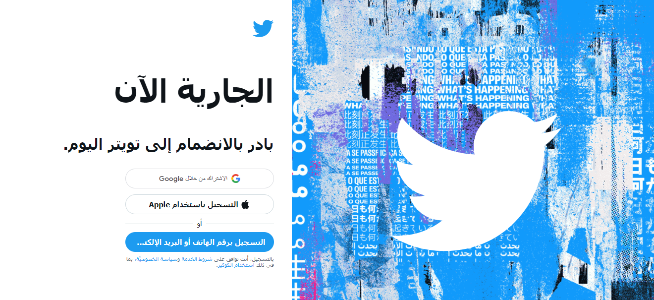
The script direction also has an impact on the whole website design. Thus, it’s recommended to mirror the layout of the web page for Right-to-Left language versions.
Here’s an example of how twitter mirrors all the content, including text, visuals, buttons, etc. for Arabic visitors.
English version:
Arabic version:
9. Choose appropriate formats and currencies
Accepted money formats can differ from country to country. They can be different even for countries with the same native language. Thus, the US displays dates as month-date-year, while the UK prefers date-month-year format. Or according to the Chinese calendar it’s 4719 year, while for European countries it’s 2022.
Same differences you can find also in other formats and units of measure: meters and fts, kilos and lbs, etc.
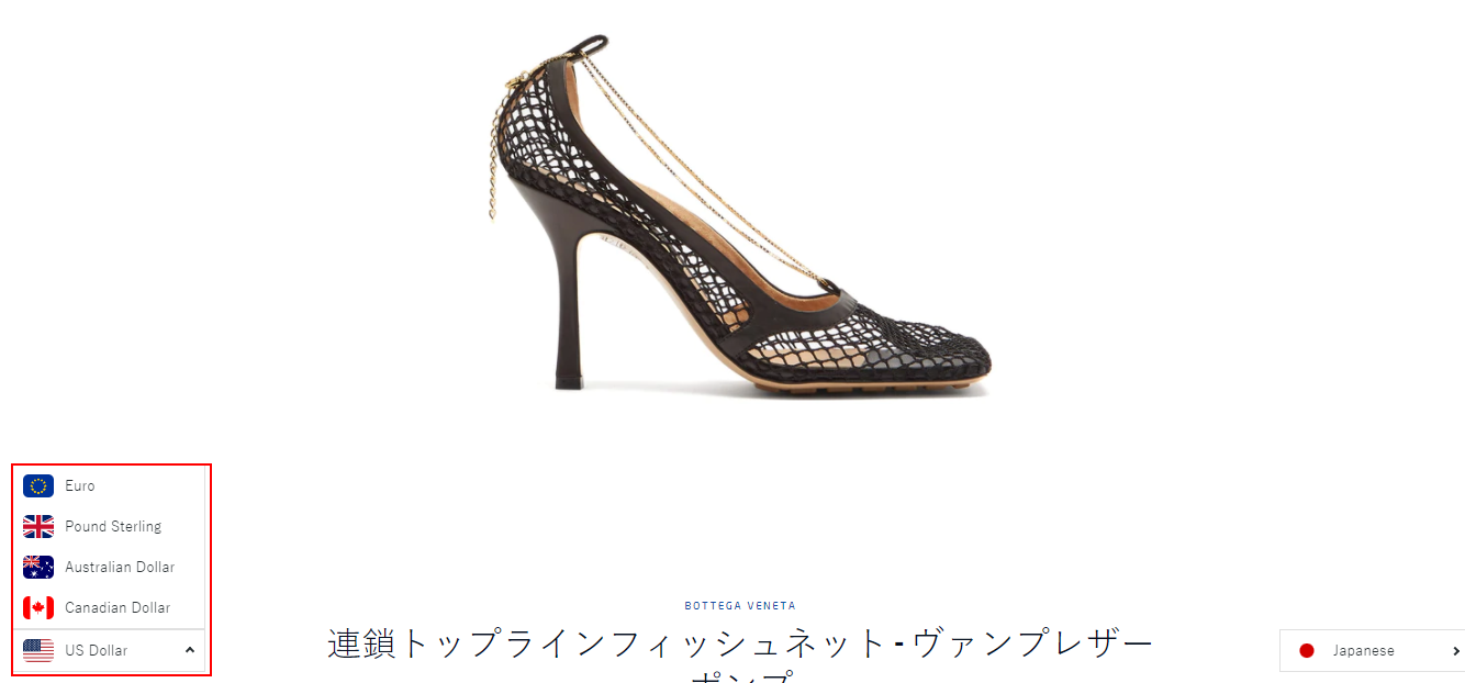
One more important thing to consider when designing a multilingual store is currency. It’s proven that selling in local currencies can increase sales among foreign audiences. Customers love to see pricing in familiar currency and not to calculate the difference. Add customizable currency switchers for more convenience and appealing icons for each currency presented on your store.
Conclusion
There is a lot to explore and consider when expanding new markets, but one thing is clear - you will need a good translation app to simplify and streamline the translation process. One of the best translation apps on Shopify market is LangShop:
- It is powerful enough to translate 100% of content on your website into multiple languages.
- LangShop supports 241 languages and 80+ currencies.
- LangShop creates 100% SEO-friendly translations and allows users to add necessary hreflang tags for better ranking.
- The app offers four translation methods including ai-machine, pro, agency and manual translation.
- It allows merchants to add and customize language and currency switchers.
Find more LangShop features here or install the app and explore its full potential yourself!
Have a happy translation!

